The story behind one of the most recognisable logos in the world
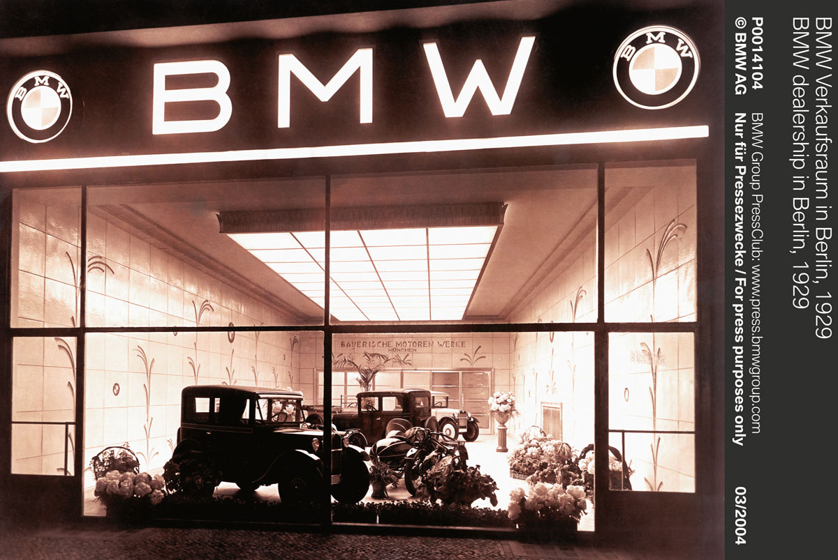
BMW has just celebrated a very special birthday. This year marks the 100th anniversary of Bayerische Motoren Werke AG (or Bavarian Motor Works). Since it was founded in 1916, the group has produced motorcycles and cars from its headquarters in Munich.
It now owns Mini Cooper as well as Rolls-Royce and has become one of the most powerful industrial entities of modern times. It’s also created one of the most recognisable brands on the planet, represented by its blue and white emblem.
Many believe that BMW’s logo comes from its heritage in aviation. The circular shape, as well as the cross dividing the blue and white areas, are said to resemble that of spinning propellers. This would hark back to BMW’s humble beginnings as an aircraft engine builder.
Or it would if it were true. In fact, the design has nothing to do with aircraft engines or propellers.
The real origins of the logo date back to 1917, when Franz Josef Popp first registered the name Bayerische Motoren Werke (the company was previously called Rapp Motorenwerke, which specialised only in aeroplane engines).

Wanting to show the world that this was a different company altogether, he created a new circular logo with BMW at the top outer ring. The inner quadrants were filled with the state colours of Bavaria, where the company was founded – but in the opposite order as the flag (at the time it was illegal to use national symbols in a commercial trademark).
The rest, as they say, is history.